Jersey Logo Placement That Looks Team-Ready
A great crest can disappear on a jersey if it is placed too low, printed too small, or crowded by a number, sponsor, and player name. Smart jersey logo placement gives your club a clear identity before the first whistle. It also makes every photo, team introduction, and sideline moment look more professional.
For coaches, club managers, and school programs, placement is not just a design detail. It affects readability, comfort, production, and how well your uniform holds up as your team grows. The right layout keeps your logo visible, your numbers regulation-friendly, and your colors working together.
Start With the Front Chest
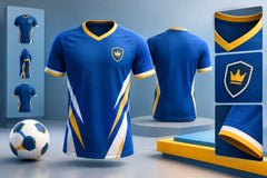
The left chest is the traditional home for a team crest. It is where players, opponents, and spectators expect to find the club identity, especially on soccer jerseys. A left-chest logo feels established, balanced, and easy to recognize from close range.
For most adult jerseys, a crest between 3 and 4 inches wide is a strong starting point. Youth jerseys usually need a smaller version, often around 2.5 to 3.25 inches, so the mark does not take over the front of the shirt. The exact size depends on the logo shape. A wide horizontal logo needs different spacing than a round badge or tall shield.
Keep the crest high enough to sit naturally over the chest, but not so high that it runs into the collar seam. That small gap matters. A logo pressed too close to the neckline can look cramped once the jersey is worn, especially when players are moving.
When a Center Chest Logo Makes More Sense
Not every team needs a left-chest crest. A center chest logo can be the better choice for a bold modern uniform, a tournament shirt, a training top, or a design built around one large graphic. Center placement gives a logo more impact from the stands and in action photos.
The trade-off is space. Center chest artwork competes with a jersey number, player name, sponsor, and any graphic pattern already built into the jersey. If you want a front number, a center logo may need to move upward or become smaller. This is where a free mockup is valuable: it shows whether the logo leads the design or gets lost inside it.
Jersey Logo Placement for Sponsors
Sponsors deserve visibility, but a jersey should not look like a crowded billboard. The best sponsor location depends on the sponsor level, sport, jersey style, and the number of logos your team needs to include.
A primary sponsor is often placed across the center chest or upper front. This position provides the largest clean viewing area and reads well in team photos. Keep enough clear space around the sponsor mark so it can be read quickly. A complicated logo with tiny text may need to be simplified before printing.
Secondary sponsors work well on the upper back, lower back, sleeve, or lower front area. Sleeve logos can look sharp on soccer, basketball, and volleyball uniforms, but they should not wrap too far around the arm. If players have different sleeve lengths or jersey sizes, a sleeve design can shift more than a chest design.
For teams with multiple sponsors, establish a clear hierarchy. Your team crest should still feel like the identity of the uniform. The primary sponsor should be the next most visible element. Smaller partner logos belong in supporting positions, with consistent sizing and spacing across every jersey.
Give Numbers and Names Room to Work
Numbers are functional. Officials, scorekeepers, coaches, and fans need to identify players fast. That means a logo layout must protect the number area instead of treating it as leftover space.
On soccer jerseys, the back number should remain the strongest element on the back. Place the player name above the number with enough separation to keep both readable. An upper-back sponsor can work above the name, while a lower-back sponsor can sit beneath the number. Avoid squeezing artwork too close to the digits, where it can make the number look broken or harder to read at distance.
Front numbers are common in several sports and can also be added to soccer kits. A small front number often sits on the opposite chest from the team crest. If the crest is on the left chest, the number can go on the right chest. This creates a clean, familiar balance.
For basketball and volleyball uniforms, number placement carries even more weight. The front number usually takes center stage, so a team logo may need to sit above it, below it, or be incorporated into the jersey design rather than printed as a separate chest badge. A design that looks great on a soccer top may not translate directly to a basketball jersey.
Match Placement to the Garment and Sport
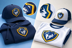
A logo should follow the structure of the garment. Mesh panels, zippers, seams, collars, pockets, and side inserts can all affect where artwork can sit cleanly. This matters on tracksuits, polos, hoodies, goalie kits, and warm-up gear just as much as on game jerseys.
On a polo, a left-chest embroidered patch or printed crest is a classic choice for coaching staff, travel apparel, and supporters. On a hoodie, center chest can make a stronger statement, while a small left-chest logo creates a more understated teamwear look. For tracksuits, consider a crest on the jacket chest and a smaller logo or player initials on the pants.
Goalkeeper jerseys offer more room for personality, but they still need a clear crest and number plan. Bright colors, bold patterns, and padded areas can change how a logo appears. A simple high-contrast crest often performs better than a detailed mark with multiple thin outlines.
Use Contrast Before You Use Size
When a logo is hard to see, teams often make it bigger. That is not always the answer. Contrast is usually the first thing to fix.
A dark crest on a dark jersey, or a light sponsor logo on a light sublimated pattern, can disappear even at a large size. Add a white outline, a solid backing shape, or a simplified one-color version when needed. The goal is not to change your identity. The goal is to make it visible from the sideline and in photos.
Sublimation gives teams more flexibility because colors, patterns, and logos are integrated into the fabric design rather than applied as a heavy layer on top. Still, detailed artwork needs careful planning. Very fine lines, tiny lettering, and low-contrast gradients may look strong on a computer screen but lose impact from 30 yards away.
Keep Placement Consistent Across Every Size
A good mockup must account for youth, adult, and extended sizing. If the logo is placed using a fixed distance from the collar or side seam, it can shift visually on smaller jerseys. Production teams often use proportional placement rules so the crest remains balanced across the full size run.
This is especially important for clubs ordering men’s, women’s, and youth cuts in the same design. A women’s fitted jersey may have different shaping through the chest, while youth jerseys have less available print space. The artwork should look like part of one unified program, not three separate uniforms.
Before approving production, check the mockup for the smallest and largest sizes in your order. Confirm that names, numbers, sponsor marks, and crests have enough room. It is much easier to adjust a layout before printing than to solve a spacing problem after uniforms arrive.
Common Placement Mistakes to Avoid
The most common problem is trying to include every idea on one jersey. A team crest, mascot, league badge, sponsor, player name, number, hashtag, and large background graphic can all be useful individually. Together, they can weaken the design.
Avoid placing important logos directly over seams, underarms, zipper lines, or heavily textured portions of a pattern. Avoid tiny sponsor text that no one can read. Also avoid using a full-color logo without checking how its colors behave against the jersey color.
If your logo is detailed, consider creating two approved versions: a full-color crest for close viewing and a simplified version for small placements or high-energy jersey designs. This gives your team more options without compromising brand recognition.
Build a Uniform That Looks Like Your Team
The strongest uniforms make quick visual decisions easy. Your crest identifies the team. Your number identifies the player. Your sponsor gets clear, appropriate visibility. Everything else supports those priorities.
RRR Sports America can turn that plan into a custom sublimated uniform with a free mockup before production, helping teams test logo size, color contrast, and placement before placing a bulk order. With the right layout, your jerseys will look organized on the rack, sharp in the lineup, and unmistakably yours when the game starts.