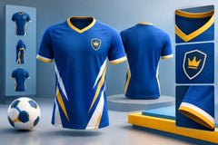
12 Volleyball Jersey Color Ideas That Pop
A volleyball uniform has to work from the first serve to the final point. Players need to spot teammates in a split second, coaches need a look that represents the program, and fans should recognize the team from the stands. The best volleyball jersey color ideas do all three while giving your roster a design they are proud to wear.
For schools, clubs, and rec teams, color is more than a decoration. It sets the energy of the uniform, affects number visibility, and determines whether your logo gets noticed. Start with colors that fit your identity, then build contrast and custom details around them.
Start With a Clear Home and Away Plan
Before choosing a wild pattern or a trendy accent shade, decide which color will lead your home set and which will lead your away set. A dark primary jersey paired with a light alternate is the most practical choice for most programs. Navy and white, black and light gray, royal blue and white, or maroon and gold give teams flexibility when opponents have similar colors.
Keep the libero jersey in the plan from day one. It must clearly contrast with the rest of the team, but it can still look connected to the full uniform. Use the same logo, font, and design language with a reverse color arrangement or a standout accent color.
12 Volleyball Jersey Color Ideas for Every Team
1. Black, White, and Electric Blue
Black gives the uniform a serious, competitive foundation. White numbers stay easy to read, while electric blue adds speed and energy across the shoulders, sleeves, or side panels. This combination works especially well for club teams that want a modern look without relying on a complicated design.
2. Navy and Gold
Navy and gold is a dependable school and college-inspired combination. Navy keeps the jersey looking sharp during a long season, while gold adds a premium finish to names, numbers, piping, or a bold chest graphic. For maximum readability, use white numbers on navy rather than gold-on-navy.
3. Red, Black, and White
A red base with black side panels and white numbering brings instant intensity. It is a strong option for teams with aggressive mascots, competitive travel programs, or a fast-paced identity. Because red is already high-impact, keep the pattern clean so the logo and number do not get lost.
4. Royal Blue and White
Royal blue is bright enough to stand out in a busy gym but classic enough to work season after season. Pair it with crisp white numbers and a simple white collar or sleeve trim for a clean uniform that photographs well. Add a small silver accent if the team wants a little more depth without changing the core colors.
5. Purple, Black, and Silver
Purple gives a team a distinct look when every opponent seems to wear blue, red, or black. Black grounds the design, and silver creates a polished detail in a sublimated geometric pattern, lightning effect, or sleeve stripe. This palette is a great fit for programs that want something different but still athletic.
6. Teal and Charcoal
Teal brings fresh energy, while charcoal keeps it from looking too casual. Use charcoal as the primary jersey color and teal for shoulder fades, angled stripes, or a large chest graphic. White player numbers are the smart choice here because they remain readable under bright gym lights.
7. Maroon and Cream
For a more traditional look, maroon and cream delivers warmth and school pride. Cream feels softer than bright white and pairs well with vintage-inspired lettering, subtle pinstripes, or a classic block number style. It depends on the venue lighting, though: if cream lacks contrast against maroon from a distance, switch to white for the player numbers.
8. Forest Green, White, and Gold
Forest green creates a strong, grounded uniform with a classic athletic feel. White numbers provide the clearest contrast, while gold can appear in the logo, waistband detail, or a thin sleeve stripe. This combination is especially effective for teams with Eagles, Tigers, Wildcats, or other traditional school mascots.
9. Orange, Black, and Gray
Orange is not for teams that want to blend in. A burnt orange or bright orange base with black numbers creates instant visibility, while gray can soften the transition in side panels or a digital-camo-inspired print. This is a smart option for youth teams and rec leagues that want a high-energy look fans can spot immediately.
10. White With a Full-Color Shoulder Design
A white jersey does not have to be plain. Use a white body for a clean home uniform, then add a bold shoulder or upper-chest design in the team’s main colors. This approach keeps the number readable while giving the jersey a custom, premium appearance. It also makes a good canvas for a detailed logo or team tagline.
11. Black With a Neon Accent
Black jerseys with neon lime, neon pink, or neon yellow accents can look outstanding for tournament teams and younger programs. The key is restraint. Let the neon show up in one or two areas, such as the shoulder pattern and logo outline, then use white for names and numbers. Too much neon can make the jersey difficult to read from across the court.
12. Two-Tone Gradient in Team Colors
A smooth gradient gives a custom volleyball uniform movement without adding clutter. Think royal blue fading into navy, red blending into black, or purple moving into teal. Sublimation makes gradients possible without adding heavy layers or restricting movement. Keep the number area solid or lightly patterned so officials, scorers, and spectators can read it quickly.
Make Numbers and Names Easy to Read
A sharp color combination fails if the numbers disappear. Contrast should be your first rule when choosing number colors. Dark jerseys generally need white or a very light number. Light jerseys generally need black, navy, or another dark shade. A thin outline can help, but avoid stacking too many outlines, shadows, and effects around the number.
Consider the actual gym where your team plays. Bright overhead lights can wash out pale gold, silver, and neon shades. Dark gyms can make navy-on-black details disappear. Ask for a free mockup before production so coaches and team managers can see how the colors, logo placement, and number treatment work as one complete design.
Use Sublimation to Build a Better Team Look
Sublimation gives teams more room to create. Rather than limiting the design to a solid jersey and a few printed marks, you can add fades, stripes, abstract lines, city-inspired textures, diagonal panels, mascot patterns, and custom color blocking directly into the fabric.
That does not mean every jersey needs a busy all-over print. The strongest designs usually have one main idea. A bold diagonal slash, a gradient shoulder panel, or a subtle tone-on-tone texture can make the uniform look premium while leaving enough open space for a visible logo and player number.
At RRR Sports America, teams can build that look around their logo, names, numbers, and program colors with custom sublimated volleyball uniforms. For bulk orders, getting the design right before production helps protect the budget and keeps every athlete in a consistent, professional-looking kit.
Choose Colors That Match Your Team Identity
Your color choices should feel right for your team, not just look good in a design preview. A school program may want colors that match the gym banners and booster gear. A club may want a bolder palette that helps it stand apart at weekend tournaments. A recreational league might prioritize bright colors that are easy to organize and identify across several teams.
Also think beyond the jersey. Match the uniform with shorts, warmups, hoodies, polos, and travel gear when possible. A black jersey with electric blue accents looks more complete when the warmup jacket carries the same blue detail. That consistency makes a team look organized before the first whistle.
The right volleyball jersey color idea is the one your players can recognize instantly, your opponents can see clearly, and your program can wear with pride. Choose a confident base color, protect number contrast, and use custom accents with a purpose. When the whole roster steps onto the court in a look that feels like theirs, the uniform has already done its job.