Team Jersey Color Combinations That Get Noticed
A jersey can look great in a design preview and still fall flat under stadium lights, on a wet field, or from the far sideline. The best team jersey color combinations do more than match a logo. They make players easy to spot, give a club a recognizable identity, and create a finished look that feels worth wearing all season.
For coaches, club managers, and school programs, color is also a practical order decision. It affects visibility, alternate kits, print contrast, supporter gear, and how easily you can reuse a design across soccer, volleyball, basketball, warmups, and travel apparel. Start with a strong color plan, then customize the details around it.
Start With a Clear Team Identity
Every strong uniform begins with one question: what should people recognize first when they see your team? For some programs, that answer is a school color. For a growing club, it may be a bold modern palette that separates the team from nearby competitors. Either way, choose a primary color that can carry the entire uniform without looking busy.
A reliable formula is one dominant color, one supporting color, and one accent. The dominant color covers most of the jersey. The supporting color shapes sleeves, side panels, collars, or patterns. The accent handles numbers, names, piping, and small logo details.
Trying to give four colors equal importance usually weakens the design. A navy, red, white, and gold uniform can work, for example, but it needs hierarchy. Navy might be the main base, white the number color, red the shoulder detail, and gold a small trim. That keeps the jersey organized while still giving the team a premium look.
Team Jersey Color Combinations That Perform
The right combination depends on the sport, your existing branding, and where your team plays. A high-contrast soccer kit built for outdoor fields has different needs than a basketball jersey used in a bright gym. These proven directions give teams a smart starting point.
Black and gold for a premium statement
Black and gold delivers a confident, high-end feel. It works especially well for varsity programs, adult leagues, and clubs that want a strong entrance on game day. Use gold for numbers and logo elements, but make sure the shade is bright enough to read against black from a distance.
For a cleaner version, use black as the base with white numbers and gold accents. White improves legibility, while gold retains the team’s signature edge. This combination also carries well into polos, hoodies, tracksuits, and fan gear.
Navy and white for a classic club look
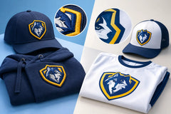
Navy and white is one of the safest choices in team sports because it stays sharp year after year. It works with stripes, diagonal graphics, pinstripes, and more traditional layouts. Navy hides dirt better than lighter colors, while white creates crisp number contrast.
The trade-off is that navy and white is common. Add a secondary accent such as light blue, red, or metallic-style gray in the sublimated pattern if your club needs a more distinct identity. Keep the player numbers in white or another high-contrast shade.
Red and white for speed and energy
Red gives a uniform immediate intensity. Paired with white, it is clean, visible, and ideal for teams that want an aggressive, fast-paced image. It is a natural fit for soccer, volleyball, basketball, and youth programs where a bright visual identity matters.
Avoid using red numbers on a dark red jersey, especially with detailed fonts. The colors can blend under evening lighting. White, black, or deep navy numbers are usually safer depending on the exact red tone.
Royal blue and yellow for high visibility
Royal blue and yellow is bright, athletic, and easy to identify from the sideline. Yellow works best as an accent or number color on royal blue. When yellow becomes the full jersey base, dark blue numbers and names are essential for contrast.
This combination is useful for outdoor teams because it stays visible against green fields and neutral stadium backgrounds. It also gives youth and school teams an energetic look without needing complicated graphics.
Forest green and white for tradition
Forest green and white feels established, disciplined, and versatile. It suits schools, community clubs, baseball-inspired teamwear, and soccer programs looking for a traditional identity. A white chest stripe, white sleeves, or white number block can make a dark green jersey look especially polished.
If you want more depth, add a small black or gold accent. Keep it subtle. Green, white, black, and gold can look outstanding, but too much black can make the design feel heavier than intended.
Light blue and navy for a modern edge
Light blue and navy creates contrast without the intensity of red or black. It feels current and works beautifully with geometric sublimation, tonal patterns, and clean shoulder designs. It is popular for soccer clubs, travel teams, and programs that want a fresh identity across multiple age groups.
Because light blue can look pale under strong sun, use navy for names and numbers. A thin white outline may help on detailed patterned jerseys, but the final design should still be readable without relying on outlines alone.
Build Contrast Around Names and Numbers
A great jersey is only useful if officials, coaches, announcers, and spectators can read it. Number visibility should be decided early, not treated as a final decoration.
Dark bases such as black, navy, maroon, and forest green generally need white, light gray, bright yellow, or another light number color. Light bases such as white, yellow, light blue, and gray need black, navy, dark green, or dark red. The goal is not simply different colors. The goal is clear separation in brightness.
Patterns need extra attention. A busy sublimated background can be a powerful team feature, but place the number over a calmer panel whenever possible. If the pattern runs behind the number, use a solid number block or a carefully chosen outline. Small lettering, thin script fonts, and low-contrast gradients may look stylish up close but are harder to read during play.
Plan Home, Away, and Goalie Colors Together
Your primary jersey cannot be chosen in isolation. Before approving a mockup, think through your full game-day set: home jersey, away jersey, shorts, socks, and goalie kit.
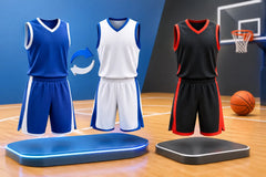
A strong home-and-away setup uses clearly different bases. If your home uniform is navy with white, an away uniform in white with navy gives you an easy switch. If your club uses red as its main color, consider a white or light gray alternate rather than another deep shade like maroon. The difference needs to be obvious to players and referees at a glance.
Goalie colors should separate clearly from both teams and match officials. Bright orange, neon green, turquoise, purple, and yellow are common choices because they stand apart from traditional outfield kits. That said, check league rules before finalizing the order. Some leagues have specific requirements for goalkeeper visibility, numbering, and uniform color conflicts.
Match Color Choices to Your Order Budget
Custom color does not have to mean complicated. Sublimation gives teams room to use stripes, fades, tonal graphics, and bold panel layouts without the limitations of basic stock uniforms. Still, the best design is one you can reorder confidently for new players next season.
Choose colors that can be reproduced consistently, and keep your logo files and approved shades organized. If you order youth and adult sizes, ask for a free mockup that shows how the number placement, logo scale, and pattern will translate across the size range. A design that looks balanced on an adult large may need adjustment for smaller youth jerseys.
Also consider the wider apparel plan. A bold match jersey can pair with simple black tracksuits, white polos, or neutral hoodies to keep the full team package practical and affordable. RRR Sports America can build that consistent look across customized uniforms and teamwear, with US sizing and design support before production.
Test the Design Before You Approve It
Do not judge color only on a phone screen. Request the mockup, view it on different devices if possible, and ask a few practical questions. Can you read the player number from a distance? Does the logo disappear into the background? Will the away kit clearly contrast with the home kit? Are the shorts and socks helping the jersey, or competing with it?
Think about your actual playing environment, too. A white uniform can look outstanding on a dark indoor court but show grass and mud quickly on an outdoor field. Black delivers a bold appearance but absorbs more heat in sunny tournaments. There is no perfect palette for every situation. The right choice balances your team image with how and where your athletes compete.
Pick colors that your players will be proud to pull on, then make the details work hard: readable numbers, smart contrast, a clear alternate kit, and a design that still looks sharp after the final whistle.