10 Soccer Uniform Mockup Examples That Work
A uniform can look great in a color swatch and still fall flat once a crest, player number, sponsor mark, and name are added. That is why soccer uniform mockup examples matter before a club commits to production. A clear mockup lets coaches and team managers see the full identity of the kit, catch layout issues early, and get player approval without ordering a single jersey.
For school programs, travel clubs, adult leagues, and rec teams, the best mockup is not always the loudest one. It is the one that makes names readable, numbers visible, colors recognizable from the sideline, and every player feel part of the same team. Here are 10 proven directions to consider for your next custom soccer uniform.
Soccer Uniform Mockup Examples for Every Team Style
1. The modern home kit
Start with one strong main color, then use a secondary color for the collar, sleeve trim, side panels, or subtle graphic texture. A navy jersey with white numbers and light blue details, for example, feels sharp without becoming busy. This is a reliable choice for clubs that want a professional look that will still look current in a few seasons.
On the mockup, place the team crest over the heart, player number centered on the front and back, and player name above the rear number. Check the front number size carefully. A number that looks balanced on a screen may compete with a large logo once printed.
2. The clean away uniform
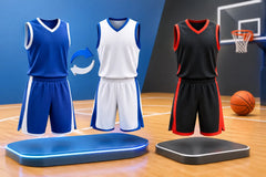
Away kits should make a clear contrast with the home kit, not just offer a slightly lighter shade of the same color. If your home set is dark blue, a white, silver, or bright yellow away jersey can prevent confusion on the field. Your mockup should show the full shirt, shorts, and socks together because contrast can be lost when only the jersey changes.
A white base gives you room for bold crest colors and clean dark numbers. The trade-off is maintenance. White jerseys show grass and mud more easily, so some clubs prefer light gray or a pale accent color for younger teams and weekend leagues.
3. The bold gradient design
A gradient mockup can give a team a fast, modern look, especially when it moves from one club color to another. Think red fading into black, royal blue blending into teal, or purple moving into white. With sublimation, the color transition is built into the fabric, so it will not crack or peel like a surface print.
Keep the rest of the layout simple. Use one solid number color with a contrasting outline, and avoid placing a complicated sponsor graphic across the busiest part of the gradient. The design needs to look good from the bleachers, not only in a close-up product image.
4. The classic striped jersey
Vertical stripes remain one of the strongest soccer looks because they are easy to recognize and carry real club tradition. Two-color stripes work best in a mockup, such as black and gold, green and white, or red and navy. Add a solid collar and sleeve cuff to give the design a finished look.
Before approving it, confirm how the front number and crest sit over the stripes. A solid patch behind the number can improve visibility, while a crest may need a clean placement area so the details do not disappear. Stripes are classic, but they demand careful logo positioning.
5. The subtle pattern jersey
Not every graphic needs to shout. Tonal chevrons, faint diagonal lines, geometric shapes, or a watermark-style mascot pattern can add depth while keeping the team colors front and center. This option works well for high schools and clubs that want something custom but not overly trendy.
In your mockup, zoom out and ask one simple question: can people still recognize the primary color from a distance? If the answer is no, reduce the pattern contrast. A subtle design should support your badge and numbers, not compete with them.
6. The retro-inspired uniform
Retro styles bring personality to tournaments, alumni teams, and clubs that want a design with more history behind it. Think broad chest bands, old-school collars, block lettering, and colors pulled from an original team identity. A simple two- or three-color layout usually captures the look better than adding too many modern effects.
This is also a smart direction for clubs rebranding without losing their roots. Put the old colors into a fresh cut, update the crest placement, and use clear modern numbers. The result can feel established rather than dated.
7. The high-visibility youth kit
For younger players, visibility and easy identification should lead the design. Bright colors such as electric blue, orange, neon green, or yellow can help coaches spot players quickly during crowded games and training sessions. Pair that base with large, high-contrast numbers and straightforward name lettering.
Avoid thin fonts, dark-on-dark number colors, and overly detailed graphics. Kids grow fast, teams change rosters, and parents need a kit that is easy to identify from across the field. A clean mockup makes ordering less stressful for everyone managing the team.
8. The premium blackout kit
A black jersey with black graphics can look powerful in a mockup, but it needs one element that creates contrast. That may be a metallic gold crest, a bright team-color number, white lettering, or a lightly textured pattern. Without contrast, the names and numbers can disappear under stadium lights or in game photos.
Blackout uniforms are best as a statement home option, tournament kit, or alternate set. They are less practical when your league requires maximum number visibility. Confirm league rules before ordering, especially for player number color and placement.
9. The matching goalie kit
Goalkeepers should stand apart, but their kit should still belong to the same club. A good goalie mockup uses a clearly different base color while carrying over one or two visual details from the field player jersey. If the team wears navy and white, the goalie might wear bright green with navy side panels and the same crest treatment.
Show the keeper jersey with matching shorts and socks in the approval mockup. Also include the front and back numbers, name placement, and any padded-area design details. A separate goalie kit is not an afterthought. It completes the team presentation and helps officials identify the keeper immediately.
10. The full club package
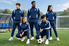
The strongest mockup example often goes beyond one jersey. It shows the home kit, away kit, goalie kit, warm-up top, tracksuit, and optional sideline polo in one coordinated view. This is especially useful for clubs placing bulk orders for multiple age groups or school programs building a consistent athletic identity.
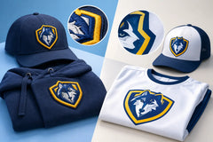
Use the same crest, font family, and core color palette across the package. The jersey can carry the boldest graphic, while travel gear stays cleaner and more versatile. This approach gives players a united look on game day, during travel, and at community events.
What to Check Before You Approve a Mockup
A free mockup is your chance to make changes before production, so review it like a coach reviewing a game plan. Check that the logo is high resolution, the team name is spelled correctly, and every number is easy to read against the fabric color. Confirm the exact player-name format too. Some teams use last names, others use first names, nicknames, or no names at all.
Look at the mockup on a phone and from a distance, not only on a large screen. Small sponsor marks and thin details may look fine up close but lose impact in real game conditions. If your club has a specific shade of red, blue, or green, share that requirement early so the artwork can be matched as closely as possible.
Sizing deserves the same attention as design. A great jersey will not help if the order uses inconsistent sizing. Collect player sizes before final approval, account for youth and adult cuts, and consider ordering a few extras for late additions or replacements. For bulk orders, this small step can save time and shipping costs later.
RRR Sports America can help teams turn an idea, logo, or existing uniform into a custom mockup with personalized colors, names, numbers, and patches. With premium sublimated options, team discounts, and a stated 15-day turnaround, clubs can move from design approval to a game-ready order without dragging out the process.
Your best next step is simple: choose the mockup direction that matches your team’s personality, then make readability and fit non-negotiable. A kit that looks united before kickoff gives players something real to represent when the match begins.