
Top Teamwear Design Trends for Modern Teams
A lot of team orders fall apart at the same point - everyone agrees on the sport, the colors, and the budget, then gets stuck on the look. That is exactly why teamwear design trends matter right now. Coaches, club directors, and school buyers are not just ordering jerseys anymore. They are building a full team identity that has to look sharp on the field, hold up in photos, and still make sense for budget, sizing, and turnaround.
The good news is that current design trends are working in your favor. Teams want more personality, more flexibility, and more pieces beyond a basic game jersey. The strongest designs are no longer just about picking a template and dropping in a logo. They combine performance, branding, and practical ordering decisions.
Teamwear design trends are getting more personalized
The biggest shift is simple - teams want uniforms that look like their own, not like a generic stock set that five other clubs could be wearing. Customization has moved from being a bonus to being the standard.
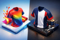
That starts with color. Instead of flat one-tone jerseys with a small contrast panel, more teams are choosing layered color builds, tonal fades, geometric backgrounds, sleeve accents, and integrated striping. These details give a uniform more energy without making it feel too busy. Sublimation has pushed this trend forward because it allows teams to add more visual depth without the heavy feel or cracking issues that can come with older decoration methods.
Names, numbers, logos, and taglines are also being used more intentionally. Buyers are paying closer attention to placement and scale. A chest logo that is too small can disappear from the stands. A number font that looks great online may be hard to read under stadium lights. The trend is toward cleaner, bolder personalization that serves both branding and visibility.
This is where a free mockup matters. Seeing the full kit before production helps teams catch issues early and make smarter design choices fast.
Retro styles are back, but with cleaner execution
One of the strongest teamwear design trends is the return of retro influence. That does not mean every team wants a throwback uniform, but many are pulling ideas from classic soccer, basketball, and volleyball looks.
Stripes are a big part of that. Vertical striping, chest bands, rib-inspired collar details, and old-school sleeve treatments are showing up again. So are more traditional color pairings that feel timeless instead of trendy. Teams like retro because it looks established. It gives newer programs a more credible, grounded identity.
The difference now is fit and finish. Older styles are being updated with sharper cuts, better moisture management, and more precise graphics. So a retro-inspired jersey can still feel current, athletic, and premium. For schools and clubs, that balance works well because it appeals to players, coaches, and supporters at the same time.
Full kit thinking is replacing jersey-only buying
A jersey and shorts used to be the whole conversation. Now buyers are thinking in systems. They want match uniforms, warm-up tops, tracksuits, training shirts, hoodies, polos, and fan-ready pieces that all connect visually.
This is one of the most practical trends in custom apparel. When a team carries the same design language across game wear and off-field apparel, it looks organized and professional. That matters for travel, tournaments, school presentation, and social media. It also matters when clubs are trying to create stronger recognition across age groups.
The best approach is not making every item identical. That can look forced. Instead, teams are repeating key design elements such as a stripe direction, a signature color block, a sleeve motif, or a logo treatment. That keeps the collection unified without making every piece feel like a copy of the jersey.
For buyers, this trend also opens up more flexibility in ordering. You can prioritize the game set first, then add travel gear and staff apparel without losing consistency.
Bold graphics are in, but clutter is out
There is a clear appetite for more visual impact. Teams want uniforms that stand out, especially in competitive club environments where appearance plays a role in recruiting, branding, and first impressions. But the strongest designs are not overloaded.
That trade-off matters. A fully packed jersey with too many gradients, patterns, slogans, and badges can lose clarity fast. From a distance, it may just look messy. Better modern designs use one or two strong graphic ideas and let them do the work.
Popular choices include angular patterns, tonal texture, digital camo influences, brush effects, topographic lines, and faded panel transitions. These work best when they support the team colors instead of competing with them. If a club already has a bold crest, the background should usually stay controlled. If the logo is simple, the jersey can handle more movement.
For practical buyers, the rule is simple - strong identity beats visual overload every time.
Fit, comfort, and US sizing matter more than ever
Design is not only what people see. It is also how the uniform wears through a full match, a tournament weekend, or a long school season. More teams are paying attention to fit because players notice it right away.
That means cleaner silhouettes, better sleeve lengths, and cuts that work across youth and adult sizes. It also means choosing custom apparel suppliers that understand US sizing expectations. A design can look perfect in a mockup and still disappoint if the fit is off when the order arrives.
This trend is especially important for clubs ordering across multiple age groups or mixed staff and player bundles. Consistency matters. Coaches and managers do not want to spend time fixing avoidable sizing problems or dealing with styles that fit one roster well and another poorly.
From a design standpoint, fit also affects how graphics land on the body. Chest bands, side panels, and number placement all look different depending on cut and sizing. Good teamwear design takes that into account early, not after production.
Training and travel gear are becoming part of the brand
Another major shift is the rise of non-game apparel as a core part of the order. Teams are investing more in hoodies, quarter-zips, polos, and tracksuits because they want a complete look beyond game day.
This trend makes sense. Players wear travel gear to school, on buses, at tournaments, and in team photos. Coaches wear polos and sideline apparel in front of parents, administrators, and opponents. These pieces do real branding work.
The smartest team buyers are treating travel gear as an extension of the uniform, not an afterthought. That usually means simpler designs with clean logos, coordinated colors, and practical wearability. A hoodie does not need the same intensity as a match jersey. It needs to feel versatile, sharp, and easy to reorder.
This is where affordability matters. When pricing is right, teams can build a stronger overall package instead of cutting everything back to the bare minimum.
Fast-turn custom design is now part of the trend itself
Speed is shaping design decisions more than many buyers realize. Teams often need uniforms for a new season, a tournament, a school launch, or a late roster update. Because of that, one of the biggest teamwear design trends is not purely visual - it is responsive customization.
Buyers want design support that moves quickly, clear communication, and production timelines they can actually plan around. A great-looking concept is only useful if it can get approved, sized, and delivered on time.
That is why modern ordering support has become part of the value. Free mockups, direct communication, bulk pricing, and a dependable turnaround help teams make better design choices without dragging out the process. For many clubs and schools, that matters just as much as the jersey pattern itself.
RRR Sports America fits this shift well because the demand today is not just for custom gear. It is for custom gear that looks premium, stays affordable, and gets done fast enough for real team deadlines.
What teams should prioritize right now
If you are planning a new order, the best move is to focus on a design that can do more than look good in one photo. It should reflect your team identity, work across your full apparel package, and stay readable and wearable for every player on the roster.
A retro touch can work. A bold sublimated pattern can work. A clean modern look can work. It depends on your sport, your age group, your logo strength, and how many pieces you plan to order. The real goal is not chasing every trend. It is choosing the right ones for your program.
The teams getting the best results are the ones that think bigger than one jersey but stay disciplined about the final look. If your design feels clear, coordinated, and built for your team, you are already ahead of the pack. Start there, and the rest of the order gets a whole lot easier.