How to Design Team Jerseys That Look Unified
A jersey is the first thing opponents, parents, and supporters see when your team takes the field. Before the first whistle, it tells people who you are. That is why knowing how to design team jerseys is about more than picking a color and adding a logo. The right design gives players confidence, helps coaches build a recognizable program, and makes every team photo look organized.
For clubs, schools, and recreational teams, the best jerseys balance identity, performance, and budget. A bold look is valuable, but it also has to be readable from the sideline, comfortable in motion, and practical to reorder when new players join.
Start With Your Team Identity
Every strong uniform starts with a clear idea. Think about what your team should communicate: speed, tradition, toughness, energy, or a clean professional look. A youth soccer club may want bright modern colors that stand out under field lights. A school program may need to match established school colors. A competitive adult league team might prefer a sharp, minimal design that feels like a pro kit.
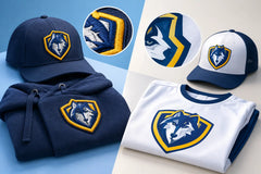
Begin with the elements your team already owns: its logo, mascot, school colors, nickname, and any established tagline. If you are launching a new team, choose a direction before choosing individual details. Trying to combine a retro crest, neon gradients, four accent colors, and oversized lettering usually creates a jersey that feels crowded.
A good rule is to choose one primary color, one secondary color, and one accent color. The primary color should dominate the jersey. The secondary color can appear on sleeves, side panels, collar trim, or stripes. Use the accent color sparingly for details that deserve attention, such as player numbers or a crest outline.
How to Design Team Jerseys With the Right Colors
Color affects visibility, team identity, and game-day practicality. A color combination that looks great on a screen may not work as well from 50 yards away. Before approving a design, ask whether the numbers will still be easy to read in sunlight, on turf, and in photographs.
High contrast matters most for player numbers. A dark navy jersey with black numbers can look sleek in a mockup but frustrate referees, scorekeepers, and spectators. White, gold, or bright red numbers may provide a much stronger contrast, depending on the rest of the design. The same applies to names on the back.
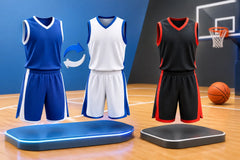
Also consider your home and away needs. If your league requires contrasting uniforms, build the two kits as a family rather than designing them separately. Your away jersey can reverse the main colors, keep the same logo placement, and use matching design details. This creates a consistent club identity without making the two uniforms identical.
Sublimated jerseys give teams more freedom than traditional printed uniforms. Patterns, gradients, striping, and color fades become part of the fabric rather than an added layer. That means you can use detailed visual elements without creating heavy, peeling graphics. Still, restraint wins. A subtle diagonal pattern or tonal texture often looks more premium than a design competing for attention in every section.
Choose a Layout That Works in Motion
A jersey is not a poster. Players run, stretch, sweat, collide, and wear the shirt under changing light. The design must look good while moving, not only when laid flat.
Place the team logo where people expect to find it: usually on the left chest. This keeps the front organized and gives the jersey a professional structure. A sponsor logo, league mark, or school identifier can work on the opposite chest, sleeve, or upper back, depending on your league rules and the amount of available space.
The center front is ideal for a team name, a clean wordmark, or a large graphic element. It is less ideal for several small pieces of information. If your front includes a bold team name, avoid placing another large logo directly behind it. Give each element room to breathe.
On the back, the player number should always take priority. Names belong above the number, while a small team mark, slogan, or sponsor can sit below it if space permits. Keep fonts clean and thick enough to remain readable from a distance. Highly decorative scripts may look impressive up close but become difficult to read during a match.
Select Fonts, Numbers, and Names Carefully
Typography can make a jersey feel modern, traditional, aggressive, or playful. It can also make a good design look cheap if the font does not match the team identity. A classic block font fits many school, soccer, basketball, and baseball-inspired looks. A more angular typeface can work for a modern club, but legibility should always come first.
Use no more than two fonts across the entire kit. One can be used for the team name or wordmark, and one for player names and numbers. More than that can make the uniform look unplanned.
Numbers need enough size and contrast to meet league requirements. Check your league rules before production, especially for sports that specify number placement, dimensions, or approved number ranges. If you play multiple sports or tournaments, confirm those rules early instead of discovering a problem after the order arrives.
For player names, decide whether you want full last names, first names, nicknames, or no names at all. Full names look official and are useful for school teams. Nicknames can add personality for recreational teams, but they should be approved carefully so the full roster remains appropriate and consistent.
Build for Comfort, Fit, and the Sport You Play
A great-looking jersey that fits poorly will not get worn with confidence. Different sports call for different cuts. Soccer players often want lightweight, breathable jerseys with enough room for quick movement. Volleyball uniforms need flexible fits that work through jumps and dives. Basketball jerseys should allow easy arm movement and pair correctly with shorts.
Always collect sizing from every player before placing the final order. Avoid estimating sizes from age alone, especially for growing youth teams. A clear size chart and a roster spreadsheet reduce costly mistakes. For larger programs, ordering a few extra unnumbered jerseys in common sizes can save time when a player joins midseason.
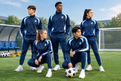
Think beyond the jersey, too. Matching shorts, socks, goalie kits, tracksuits, polos, and hoodies create a more complete team presentation. You may not need every item for every season, but planning the full color system now makes future additions easier. The travel gear should look connected to the game uniform, not like an unrelated purchase.
Review the Mockup Before You Approve It
A mockup is where your ideas become a real uniform plan. Use it to catch details that are easy to miss in conversation: a logo that is too small, a number color with weak contrast, a misspelled name, or a sleeve pattern that distracts from the front.
Review the mockup with more than one person. Coaches should check league requirements and overall appearance. Team managers should verify spelling, roster numbers, and sizes. If players or parents are involved in the decision, set a deadline for feedback. Endless design changes can delay production, particularly when your first game is approaching.
Before approval, confirm these details:
- The correct team name, logo version, and colors
- Every player name, number, and size on the final roster
- Home and away color requirements for your league
- Placement of sponsor logos, patches, and taglines
- The expected production and shipping timeline
Design for Your Budget Without Looking Basic
Team uniforms do not need to be expensive to look premium. The key is putting your budget into the details players and supporters notice most: clean color contrast, quality sublimation, accurate logos, readable numbers, and a coordinated look across the roster.
A simpler design with strong colors and professional placement often beats an overcomplicated design with too many features. If funds are limited, prioritize the game jersey and shorts first. Add warm-ups, hoodies, or fan gear later using the same visual system.
For team orders, gather the full roster before ordering whenever possible. Bulk quantities can reduce the per-player cost, and placing one organized order helps prevent mismatched colors or different jersey versions. If your team expects to grow, save the final artwork, color references, and font choices so reorders stay consistent.
RRR Sports America helps teams turn those ideas into custom sublimated uniforms with free mockups, team-order pricing, US sizing, and fast production options. Whether you want a classic striped soccer jersey, a modern gradient volleyball top, or a bold basketball set, the goal is the same: make every player look like they belong to the same team.
The best jersey design is one your players are proud to pull on before game time. Keep the identity clear, the details readable, and the ordering process organized, then let the uniform do what it should do: make your team look ready to compete.